Photographers Images
Photographers - Getting The Best Out Of Your Images - We now work with sRGB files...
When dealing with colour it really can be a minefield - As a professional, you will know this. You have probably set up your image workflow to suit your desktop proofer or inkjet printer, or maybe it is that you send your images to a colour lab to get them printed... We strongly recommend you read this page in full if colour accuracy is important to you - We have UPDATED how we deal with files and now operate a fully fledgedsRGB workflow...
Not all printing methods are the same and your images should be formatted correctly for each method of print you intend to use. Commercial printing is no different so read on how to set up your images correctly for commercial printing with us at Colour Calendars. You can leave your images in sRGB format and we will convert them for you before we print.
We use the format: sRGB IEC61966-2.1 - It is important you use this format for best results, do not use Adobe 1998.
We let the PRINTER do the conversion and now retain the sRGB all the way through the process right up until the last moment, then let the printer make the final colour conversion between sRGB and CMYK...
Preparing your images correctly can see the best results from your images when printing your calendar with us. A few golden rules that you can follow to get the best out of your images and get a print result that resembles what you see on your screen. If you get your images right before they go in, then they should come out correctly at the printing stage.
It is important to Remember we print in CMYK: (but you should leave your images in sRGB)
It is very important to remember that we print in CMYK and not sRGB and although we do convert your files to CMYK for you, as these two colour spaces are different there is likely to be a change from what you see on screen to what actually gets printed. We recommend that you format your images to the standard sRGB colour space as this will provide the best most vibrant conversion using our new process.
Adobe Lightroom will support this as an export profile and is usually set to this as standard out of the box - we DO NOT recommend you use the PROPHOTO format as this can provide drab, dark and colourless images when we print them.This new process should make it easier for you to use your images in our designer studio knowing that you do not have to convert to CMYK yourself.
 Using Adobe Lightroom:
Ok, lightroom does not deal with CMYK images - But thats ok, as we like your files in sRGB - so if you are using this software only really need to make sure that you format your images in the sRGB profile. Whatever you do DO NOT choose to format your images in the PROPHOTO profile - this profile is NOT suited to commercial printing and will provide undesirable results. If you do not change this profile you will expect to see your colour change dramatically when printing from what you see on screen.
IN ALL CASES WHEN IT COMES TO COLOUR AND PRINTING, WE 100% RECOMMEND THAT YOU GET A PRINTED PROOF TO MAKE SURE YOU ARE GOING TO BE HAPPY WITH WHAT COMES OUT PRINTED FROM WHAT YOU SEEON SCREEN.
 Converting to CMYK using Adobe Photoshop - No longer required - but if you want to here is how...
 Make sure your colour settings are correct, to set up your colour setting, go to the EDIT menu and choose > Colour Settings. In this menu you have the choice of presets, your best choice for UK commercial printing is to choose EUROPE PREPRESS 3 - this will adjust your ICC profile to the coated Fogra39 profile for CMYK images which is what we use when printing.
- Once you have set up this you can then start to open your images and then convert to the CMYK format.
- To convert your images, use the Image Menu header and choose > Mode > CMYK. By selecting this your image will then be converted to the correct colour space for printing.
- It is at this point you should then adjust your colours and or balance/saturation and what you see on screen should then resemble what gets printed.
- Also, make sure you have the correct resolution for printing, this is 300dpi for optimal printing.
Save your images as JPEGs in this format and then use them in your online designs. Jpeg format help keeps the file size down for creating your calendars online. You cannot upload a TIFF file when designing online so saving in this format is the best way to go.
DIGITAL PRINTING - What you need to know...
 We print our calendars using DIGITAL printing equipment. This uses EA vegetable-based toners which are then fused to the paper.
The colour is made up of 4 colours (Cyan, Magenta, Yellow and Black) toners which SIT on top of the paper then get a hot roller process fusion to the paper. This results in a more vibrant print than traditional inks that can 'seep' into the papers. Some people may say this is oversaturated, however, it is not, it is simply because we do not use a wet ink printing method which can dry back and dull down as the ink seeps into the paper. There is no dry back with digital print so your prints stay lush and vibrant.
As a recommendation we always say if colour is important to you then get a printed proof - this can save a lot of money in the long run if you are conscious of how your calendar is going to be printed and the colour output.
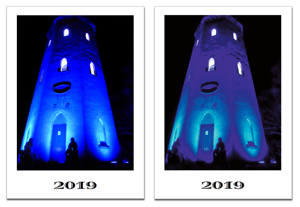 CMYK vs sRGB - Just what exactly can happen?
OK, so now you know that your images will print differently based on what format and colour space you use, it would be worth showing you how this affects your images.
Shown here is an image formatted in sRGB and is lovely and vibrant, and then the same image shown converted to CMYK. You will see the image has lost some of its colour when converted to CMYK - this is because the CMYK spectrum of colour cannot match the same spectrum that RGB can reach.
RGB can host 16,000,000 (million) colours - however CMYK can only print x16,000 colours - so you do need to expect a change, but its not that drastic.
If you leave your images in RGB and then we print them, the printer automatically converts the images during the process to CMYK, based on what's going in it tries to replicate this as best as possible. As a recommendation we always say if colour is important to you then get a printed proof - this can save a lot of money in the long run if you are conscious of how your calendar is going to be printed and the colour output.
 But My Screen Shows My Images How I Like Them...
Yes, of course, ...its YOUR screen, you are used to this, and you accept this as being 100% CORRECT - but as equipment is all different, as lighting and ambient environments change, some bulbs are yello, some are white, you may view your screen in the daylight, all these will affect how colour ispercieved - who is to say your screen is 100% colour accurate over the screen in your conservatory room, or the HD screen on your friends tablet or phone in their garage - which one is right? The image here shows just how different things can look, which one is correct? Neither - usually the printed proof is correct.
This is a massive topic and we cannot go into it -but quite frankly you cannot rely on what you see on your monitor to be 100% correct. We calibrate our monitors here to match what we see on screen to what comes out from OUR printers. Generally what we see is what we get,, why? because we have the printer right here next to us and can see what comes out - directly - so for us on our screens, stuff looks pretty accurate. We dont have access to YOUR screen, through YOUR eyes so we cannot comment on your side of things, only what we see here. If you want perfect colour, you MUST get a printed proof.
So the Final Outcome?
We mention it quite a bit here, if you are in any way conscious of colour or expect a specific output based on what you see then you really should be ordering a printed proof. We offer different levels of proofing, here they are explained in full:
1 - No Proof - I Accept The Printed Result:
This option is to proceed without a proof of any kind. You will assume full responsibility for the product you receive with regards to the information you have given us. Any errors present in the file, such as spelling/grammar mistakes or misplaced images will be your responsibility. We are still, of course, responsible for print or finishing errors such as lines on the printing, or an image missing that is present in the design file.
2 - Email Proof
For this option, we send your file again to you after your order is placed. This file will be a low-resolution PDF file optimised to be sent by email. There will be a loss in quality for this proof and cannot be used for quality or colour accuracy - this email proof will be purely content only and is a good way of double-checking everything is ok with your file one last time before it goes to print - You CANNOT use an email proof as a colour accurate proof.
3 - Unbound Printed Proof
This means we will print your file out and proof physically. Here you will see the actual output for colour accuracy and final quality. If there is anything wrong at this stage we can then look to rectify any issues. Perhaps the colour isn't right or the quality of the images is too poor - we can then work together to rectify any issues to get the right output so everyone is happy.
4 - Full Bound Printed Proof
The same as above, but here we fully finish your proof into a final item, so any calendar binding and punching will be included showing the final product exactly as it's going to be produced.
